The type of devices that can be used to go online is becoming more varied. Users access the internet through traditional desktops and laptops, as well as netbooks, tablets, videogame consoles, mobile phones and ebook readers. Because many online surveys are designed to be taken on a standard desktop or laptop screen, it is important to monitor from which device your online sample is taking the survey, and to consider the consequences the device might have for visual design impact and survey estimates. A survey designed to be taken on a desktop does not necessarily or automatically look the same when taken from netbooks, smartphones and other devices.
The Pew Internet and American Life Project has been tracking the percent of English-speaking Americans who use a cell phone to access the Internet. Among cell phone owners, this percent was 25 in April 2009, 32 in December, 34 in January 2010 and 38 as of May of 2010 (Smith 2010). This is clearly a rapidly rising trend.
Because of the possibility of accessing web sites via a handheld device, we should expect that some respondents will attempt to take a web survey from their mobile phone.
This article will present a description of some tools to collect paradata (Couper 1998; Couper and Lyberg 2005; Heerwegh 2008) that allow us to understand from which device the online survey is accessed, along with an initial suggestion for best practices.
Some technical observations
From the beginning of online survey research, it was considered a best practice to test a survey on different browsers (i.e., Netscape, Internet Explorer or Safari) and screen resolutions (Dillman and Bowker 2001). Years later, browsers became more compatible with each other and screen resolutions increased towards a minimum common denominator (e.g., 14–15 inches with a 1024 by 768 dpi screen resolution).
Concept 1: Screen resolution is not strongly correlated with screen size anymore.
Knowing the screen resolution does not necessarily predict screen size because resolution can now easily be changed on a monitor.
Concept 2: The screen resolution will tell you the screen ratio.
More diverse screen ratios have entered the market, with a tendency towards widescreen format of 16:9 ratio for desktop and laptop computer. Mobile phones and PDAs have an even higher variation of screen resolutions and ratios. For example, Zahariev et al. (2009) report that there are about 1,600 different models of smartphones, which gives a proxy for the wide variation in mobile screen sizes.
Concept 3: Screen sizes are getting bigger for desktops computers, stabilizing for laptop and notebooks and getting larger for smartphones.
If a web survey is optimized in terms of spacing among the question elements, font sizes, and position of the question that can be seen without scrolling for a 1024 by 768 resolution on a 14-inch screen, this does not guarantee that respondents will have the same visual experience across devices. In the following paragraph some considerations about different devices will be laid out.
Monitors for desktop computers
Desktops monitors have increasingly become larger and have higher resolutions.
Laptop and netbooks
Laptops have higher resolutions, keeping screen size constant, but netbooks are dramatically changing the market by providing smaller screens, generally towards 8 or 9 inches. Moreover, the screen ratio of netbooks seems to converge towards a 16:9 and 5:3 ratio. These new ratios require the user to scroll down more because the height of the screen is shorter, relative to a constant screen size.
Web enabled mobile phones
More and more mobile phones are web-enabled and can be used to browse websites. The trend is to have larger and larger screens. Among the smartphones with the largest screens are the iPhone (3.5”) the Nexus One (3.7”), the HTC Evo (4.3”), and the Blackberry Storm (3.25”). All these sizes are measured diagonally. These phones represent the upper end of the spectrum. Other phones have a much smaller screen, and most Blackberry and Palm phones have a screen size ranging from 2.2” to 3.1”.
Other devices
New devices are capable of browsing websites and should be mentioned: tablets, electronic book readers, videogame consoles, and computers connected to TVs. The visual experience of these devices varies greatly.
Key concept 4: Even if we know the screen size and resolution of a device, it is important to collect information about what the respondent can actually see within the browser before scrolling. This depends on two variables: whether the browser is open at full screen, and the kind of browser/toolbars installed (as explained later).
Using paradata to collect what kind of device has been used to take the survey
By inserting some javascript in the online survey, it is possible to collect three variables that can inform the researcher about the device being used to complete the survey:
Type of browser used to access the page
This information is collected in what is called a “user agent string”, which is a text variable that can be captured when connecting to a website. If properly analyzed it can tell, for example, if the user was connecting to the internet from a computer or a mobile device, and more precisely from which specific device. As an example, point your browser to the following website http://user-agent-string.info and click “Analyze my UA.”
User agent strings are not standardized and will change depending on the device and the type of browser used. With a little patience, however, they can be analyzed so that we obtain information on the type of device and browser.
Screen resolution
Although screen resolution is not highly correlated with screen size it is an important variable that should be collected for data validation purposes.
Available browser space or browser windows size
This variable collects how much screen is available when excluding the browser toolbars, navigation and scrolling bar. The output is in number of pixels. The available browser space will tell us exactly how many pixels could have been seen by the respondents without doing any scrolling. It will also tell if the browser was open at full screen or not. The available browser space is the real estate that has to be taken into account when programming web surveys.
As an example, point your browser to http://whatsmy.browsersize.com/ and you will see your browser screen resolution and available browser space. Try to resize your browser window and refresh the page to see how the browser window width and height are changing. (This site does not always work with mobile devices).
To learn how much a user can see of a website before scrolling (viewable area before the fold) one can use the Google Browser Size tool (http://browsersize.googlelabs.com). It is based on statistics of users visiting the Google search page. By entering the URL of the website (or web survey) in the tool, one can see the percent of users who see that particular section of the webpage before scrolling.
Web survey implications for visual design
When a survey designed only for a desktop computer is accessed via a mobile device there are visual and usability issues that arise. In the following section, screenshots of the same page were taken from different devices.
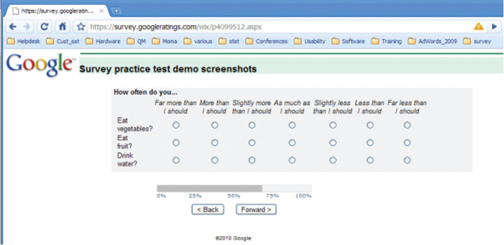
The entire width of the survey questions (grey area) is no more than 700 pixels for a height of 370 pixels. We can safely assume that anybody on a desktop/laptop and even the smallest netbook can comfortably see the entire grid as is shown in Figure 1 without scrolling (assuming the browser is open at full page).
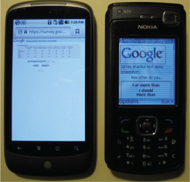
In order to show how the same page will appear on mobile phones, I selected two extremes: a phone with a large screen and high resolution, and a phone with a smaller screen size and resolution. The first phone is the Nexus one (N1) with a screen size of 3.7” and a resolution of 800 by 480 DPI. The other phone is a Nokia N70 with a screen size of 2.1” and a resolution of 176 by 208 DPI. The version of the survey software used did not adjust the survey to mobile devices.
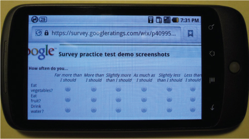
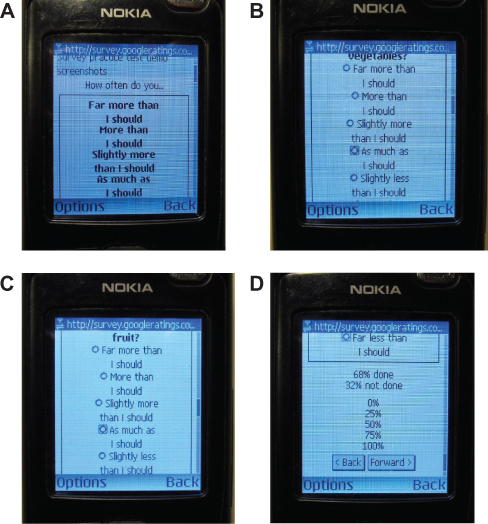
Figure 2 shows that the Nexus One (on the left) adjusts the size of the page to fill the entire screen. At this zoom level it is very difficult to read and select response options. In contrast the N70 (on the right) does not render tables.
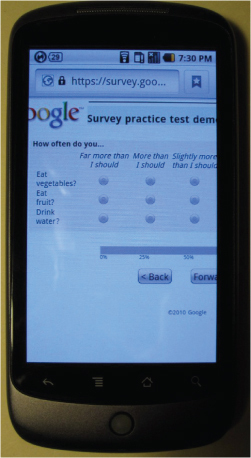
Figure 3 shows the N1 device, zoomed in to enable reading and answering. However, when zoomed in, only three of the seven response options are immediately visible; the user must scroll to the right in order to see the full scale.
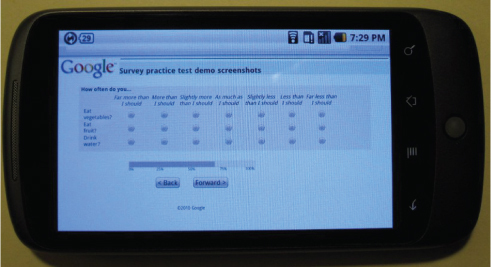
By tilting the phone, the page is resized to horizontal view. However, given the small text size and the close placement of the radio buttons, the survey is still not really usable for selecting answers with a finger.
The screen usability is increased and it is possible to select answers although the last response option (“Far less than I should”) is not visible.
The response options of the grid are placed in bold at the top of the screen (Figure 6a), making the screen very confusing. By scrolling down it is possible to read the single items and select a response option, although not all response options can be seen at once. With a little patience it is possible to select answers but the entire layout is confusing at best.
The two examples above illustrate the best and worst case scenarios of rendering a web survey page on mobile devices.
If a survey is not designed to be taken on a mobile device there are two data issues that should be studied:
- whether there are increased numbers of data entry errors for questions with problematic displays (e.g., large and long grids, display of images, open-ended questions, and check boxes)
- whether respondents are more likely to break off or partially complete a survey on mobile devices.
The first issue, has been addressed by Peytchev and Hill (2010). The authors found undesirable effects in the quality of responses due to the small screen and keyboard size.
The second issue was tested by Callegaro (2010). In a February 2010 online customer satisfaction survey of advertisers in Asia, browser type and screen resolution paradata were collected. The questionnaire was not optimized to be taken on a mobile device and in the email invitation no suggestions were made on what device to use. Among all respondents who attempted to complete the survey, 1.2% did so from their mobile device. Breakoff rates were 22% for desktop/laptop respondents, vs. 37.4% for mobile respondents. Partial interviews were 12.4% vs. 18.3% for desktop/laptop and mobile respondents, respectively (overall X2=23.06, p≤0.000, df=2). Similar results were found for another online customer satisfaction study conducted in North America in June 2010. Among all respondents who attempted to complete the survey, 2.6 % did so from their mobile device. Breakoff rates were 8.4% for desktop/laptop respondents, vs. 24.2% for mobile respondents. Partial interviews were 3.6% vs. 6.5% for desktop/laptop and mobile respondents, respectively (overall X2=114.78, p≤0.000, df=2). In a third study of similar topic conducted among seven countries in Europe in October 2010, 1.8% of respondents attempted to complete the survey via a mobile device. Breakoff rates were 13.4% for desktop/laptop respondents, vs. 24.7% for mobile respondents (overall X2=61.65, p≤0.000, df=2). In this study we were able to collect more detailed paradata to understand whether the respondents who started the survey via mobile phone also completed it via mobile phone or switched to desktop/laptop. Among the respondents who started the survey via mobile phone only 7.1% switched to desktop/laptop to complete it.
A variety of approaches can be taken to address the problems that arise when respondents access surveys on mobile devices. The following solutions range from making no changes at all to designing surveys that are fully compatible for multiple/mobile phone devices:
- Not changing the surveys at all, but analyzing user agent strings to flag respondents who complete the survey using a mobile phone. Depending on the number of respondents taking the survey from a mobile device or other criteria, the researcher might decide to eliminate them from the analysis or to carefully handle them according to some rules.
- Block mobile phone respondents. This can be done by recognizing the user agent string on the landing page and sending them to a page where a special message is displayed. These respondents should be flagged and a tailored email reminder can be sent inviting them to complete the survey from alternate devices (e.g., “We noticed that you attempted to take our survey with your mobile device. To obtain the best survey experience possible, please complete the questionnaire from a desktop or laptop computer. We appreciate your participation in our survey.”). This solution might lead to higher drop off rates for these users and needs to be carefully experimented.
- Depending on the market penetration in the country where the survey is being conducted, optimize the survey to be correctly displayed on the most common devices (e.g. IPhone, Blackberry, Android, etc.) All the other devices will be redirected to a special page as outlined in solution b. This choice necessarily requires new design decisions in terms of questionnaire layout, formatting, number of response options, usage of grids, and usage of pictures and videos in the survey. It also requires the use of a survey platform that can handle mobile phone surveys.
- Have the survey be fully compatible to be taken from any device. This solution is related to the previous one, and it requires a survey platform that can handle desktop and mobile devices.
Designing for mobile surveys
Although it is outside the scope of this paper to provide guidelines for designing mobile phone surveys (Fuchs 2008), some indications and reading material are provided.
At the current stage there are not many guidelines for designing mobile web surveys. Even if some suggestions are available in the literature (Couper 2010; Tarkus 2009; Zahariev et al. 2009), very few randomized experiments have been conducted (Peytchev and Hill 2010). For a typology of mobile surveys the reader can refer to Maxl (2009) and Townsend (2005). Software platforms that can handle mobile phone surveys are discussed in Macer (Macer 2007b, 2007a), Li and Townsend (2009), Pferdekämper and Batanic (2009), Townsend (2005), and Weber et al. (2008). Recent examples of surveys conducted on mobile phones are found in Okazaki (2007), Vicente et al. (2009), Wallisch and Maxl (2009), and Zaharievet al. (2009).
Immediate actions
In comparison to earlier market research (Macer 2010; Okazaki 2007; Weber et al. 2008) papers, the survey research arena seems less aware and worried about respondents taking surveys from mobile devices with some exceptions (Cazes et al. 2010; Pazurik and Cameron 2007). It is the goal of this paper to provide suggestions to practitioners and data collection agencies. Here is an initial proposal:
- Start collecting user agent string, screen resolution and available browser space routinely in your online surveys. This information should be collected at multiple points in time during the questionnaire because users may switch device in the middle of the survey. Another strategy would be to collect multiple user-agent strings for respondents re-entering the survey.
- If you are using an external service or an online panel, ask the vendor to do the same and to provide these paradata as part of the dataset and standard report.
- Try to test the survey using different devices to understand how questions are rendered on the screen, how answers can be selected, and how navigation proceeds. Ideally use at least one netbook and some common mobile phones.
- Keep in mind your target population and the prevalence of internet-enabled mobile phones in the country where the study is conducted. For example, if the survey involves a student population (e.g., student satisfaction survey), an employee study for a company that provides internet-enabled mobile phones (e.g., Blackberry), or where high penetration of mobile devices would be expected, then solutions (b) to (d) should be strongly considered. The same logic should be applied if the sample is highly correlated with demographics of smartphone users, e.g., African-Americans, Hispanics or young adults (Horrigan 2010; Smith 2010).
It is time to go back to the origin of online surveys, when it was considered a standard best practice to test the survey on different platforms. Now more than ever, a wide variety of devices can be used to access the web, and surveys should be designed to stay compatible with current Internet access trends. This issue will become increasingly important in the future, as the proliferation of mobile and other devices continues.
Ultimately, all online surveys should be designed to display as accurately on mobile phones, netbooks, and tablets as they do on desktop and laptop computers. While it is currently a minority of respondents who are taking surveys from their mobile device, we should collect paradata to monitor the trend and prepare for a future of increased mobile usage. There are still many unknowns in designing questionnaires for mobile devices. It is the hope of the author that this paper will raise awareness and spur new studies on the topic.
Note: This paper benefitted from comments of Mick Couper, Adam Ghobarah, Vani Henderson, Tim Macer, Kristin Maczko, Leslie Townsend and Ana Villar.


